SparkSync

Overview
SparkSync is a modern digital dating platform designed to foster meaningful and authentic connections. It emphasizes inclusivity, welcoming individuals of all backgrounds, genders, and orientations. User safety is a top priority, with features like AI-driven security, profile verification, and user-controlled boundaries. The platform offers enhanced matchmaking, allowing users to find compatible partners based on shared values, interests, and relationship goals. With a personalized experience, users can customize their preferences and dating journey. SparkSync aims to create a supportive community where everyone feels safe, heard, and valued. Join SparkSync today to embark on your journey towards meaningful connections.
Project Goal
The primary goal of SparkSync is to create a digital dating platform that focuses on fostering meaningful connections, ensuring user safety, promoting inclusivity, and providing an accessible user experience.
Key Features
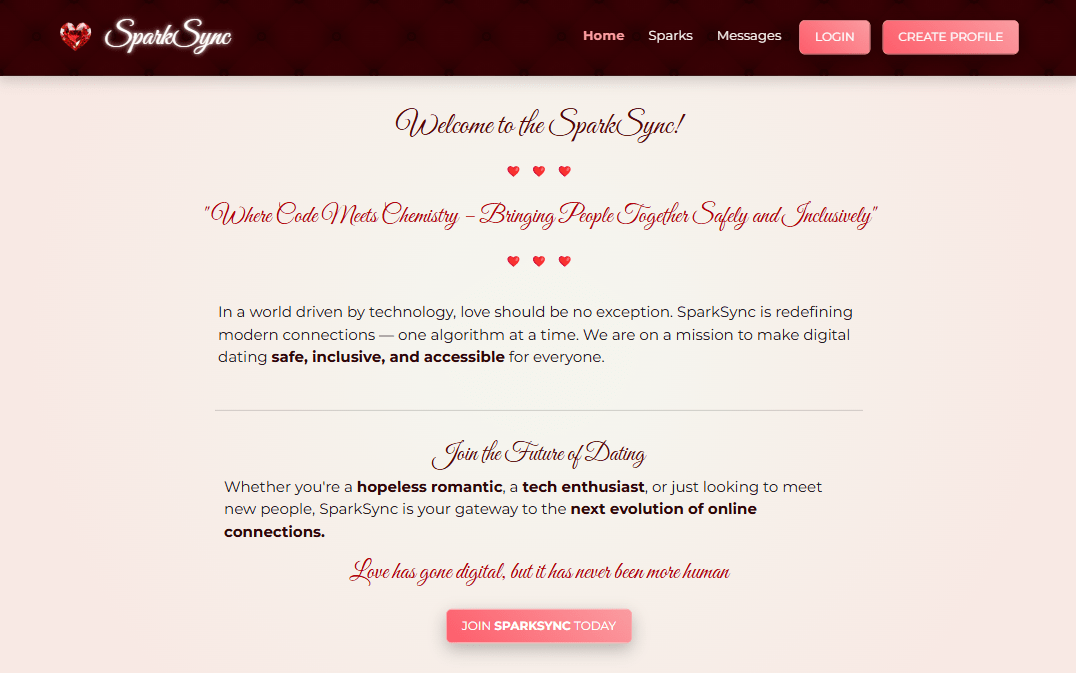
- Home Page – A modern and inviting homepage that introduces SparkSync and its mission.
- Sign Up & Login – A seamless registration and login process for users to create and access their profiles.
- Profile Creation – Users can build detailed profiles with preferences, interests, and a photo.
- Messaging System – Secure in-app messaging for meaningful conversations.
- Safety & Security – Profile verification, privacy controls, and reporting features to ensure a safe dating experience.
- Inclusivity & Accessibility – Designed to be welcoming for all genders, sexual orientations, and backgrounds, with an intuitive user experience.
- Personalized Preferences – Users can filter and refine their matches based on specific dating preferences.
- Mobile-Friendly Design – Fully responsive platform optimized for all devices.
Color Scheme
The color scheme combines deep, romantic burgundies with neutral tones to create an elegant and intimate atmosphere. The rich red hues evoke passion and warmth, symbolizing the spark of connection and romance. The soft, neutral shades provide a calming backdrop, ensuring readability and accessibility.
Seasalt was used for content areas requiring high brightness and clarity.
Cool ivory was used in main background gradient, providing a slighty warmer, inviting atmosphere while being easier on the eyes.
Pink adds a soft, romantic touch to features.
Light burgundy was used for hover states and secondary elements.
Dark burgundy adds depth and sophistication.
Red was added as accent color for important elements.
Charcoal was used for main text providing strong contrast and readability.
My Contribution
As the SCRUM lead for this hackathon project (2nd place), I ensured the team remained organized and efficient by managing a Kanban board. I also contributed to development by overseeing Git workflows, designing the user interface, and implementing key pages, including the Team, FAQ, Privacy Policy, and Contact pages.
Tech Stack
Python
Django
Bootstrap
Resend
Redis